Website Redesign 2022
Starting the new year off fresh. A new look and new tech.
It's exciting to start something new. It gives us the opportunity to clear out the cache in our heads and put a new thing out into the world. No tech debt, no stretching along the poor ideas of our previous selves. For me, I wanted to switch it up and make something new that reflected where I'm at today, my skill sets, interests, etc. A place where I can show what I care about now. Often these sites tend to grow stale.
How it started
This is the third version of my personal site. Well, it's kind of v3.5, actually. I nearly finished the last iteration a few months ago.
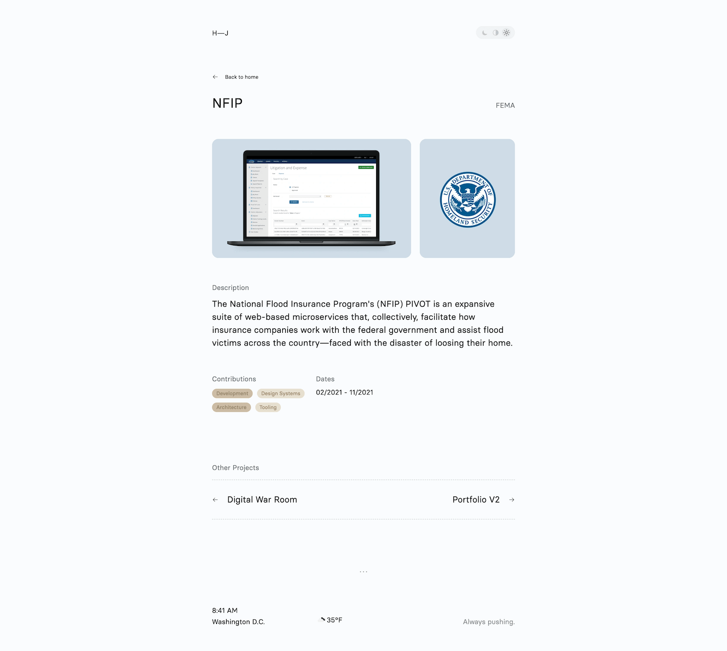
This is one of the screenshots of the details page before the redesign.
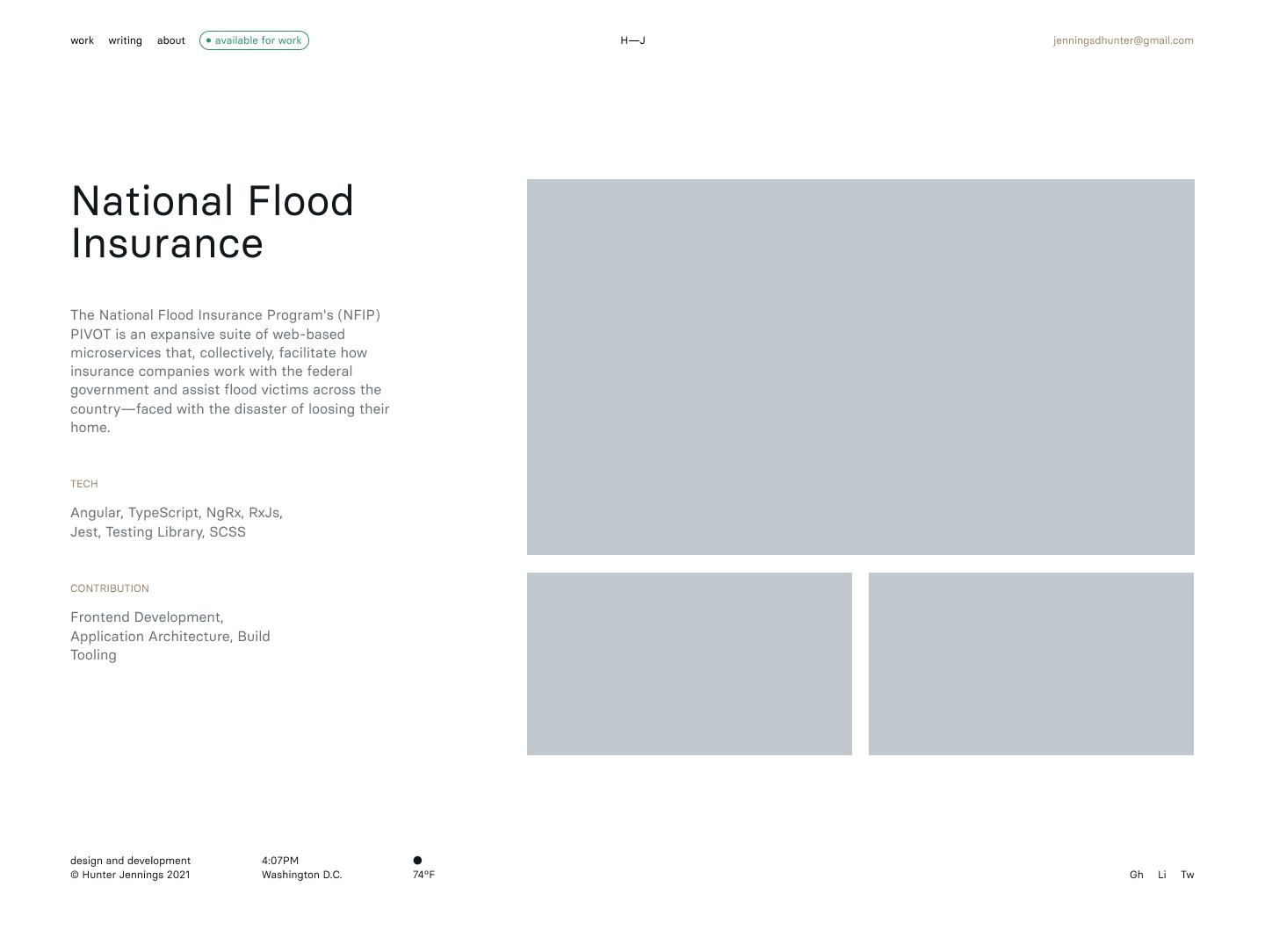
This is after the redesign.
Nearly 80% of it was fully designed and implemented until I decided to scrap it all, leaving only the tech stack choices behind. It's always that last bit. It wasn't giving me the feel I wanted. I noticed that I was making the exact same mistakes that I did with previous iterations. I'd end up getting lost in the design details that don't have any meaning. They don't actually get you to finishing the goal you set out to complete in the first place.
I couldn't already be sick of this thing. That ended up being enough of a signal that I needed to suck it up and start over.
I didn't want to overthink it. Simplicity, consistency, maintainability were my top priorities—especially maintainability. I didn't need to reinvent the wheel, and it most definitely should not feel like a chore to update and edit or add new content. We all know where that leads sigh...back to Figma.
How it's going
This is what I came up with after a few weeks of nights and weekends. The design stands on the many shoulders of those I admire and look up to in my field of UI development. These people inspired me to ditch all of the noise and reject the traps found in over-designing. Instead, favoring an approach of simplicity, which strips away all the excuses one could make, and actually showcase what really matters—the content. If you see a design idea you like, go ahead and steal it!
Shout-out to Paco Coursey, Carl Barenbrug, Rauno Freiberg, Pedro Duarte, Lee Robinson, Tim Chang, Jenna Smith, and others—there's a lot of them—for all of the inspiration.
Now that I'm "done", I'm hoping I can start the new year off strong and share more about myself, my process, things I'm interested in. I've been on the receiving end of so many generous people taking the time to write insightful and useful posts about technology that I'm learning about. Hopefully I can give back a bit where I can.
Tech stack for nerds
Ah, the most important part, the tech stack:
- TypeScript
- React
- Next.js
- I used this framework heavily at Elegant Seagulls and I'm extremely bullish about its future. The team consistently raises that bar with each release.
- Vanilla Extract
- Radix
- Un-styled utility components for building accessible UIs.
- MDX
- How I'm able to write this blog.
- Framer Motion
- Declarative animations for React.
The site is open source on GitHub, feel free to check it out and reach out if you have any questions about it. My DMs are open.